Insights / Article
Startup branding: what you need before launchWhat to make first, and what waits
A brand before launch needs a name, a voice, a mark, a palette and the first assets people see. Here is the order we make them in, and what can wait.
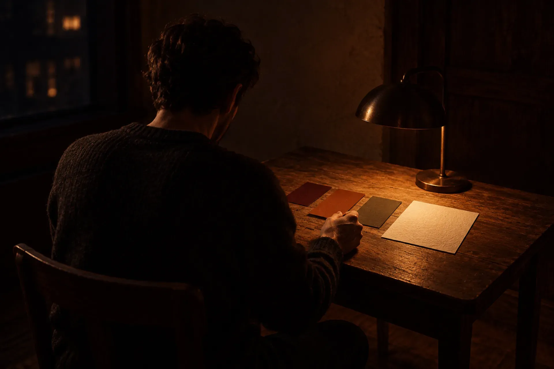
Startup branding before launch comes down to five things: a name, a voice, a mark that still reads at 16 pixels, a color and type system set as design tokens, and the first assets people see, such as the app icon, the store screens and a deck. We make them in roughly that order, alongside the product strategy, so the brand is ready by the time there are screens to put it on. Most of the rest can wait until after launch. Our branding service delivers exactly this set, and this note walks through each part.
Why the order matters
Each piece leans on the one before it. A mark is hard to judge before you know what the product is called. A palette is hard to choose before you know how the product talks. Store screens are hard to make before there is a mark and a palette to make them with.
The order also follows what launch day asks of you. People will see your name, your app icon and your store page before they open anything. Those have to be finished. A forty-page brand book does not.
Start with the words you already use
Before we draw anything, we collect the words that already exist: how you pitch the product, what early users call it, what the market around it says. That goes on one page, the brief.
Most founders have more of this than they think. A pitch deck, a recorded call, reviews of the tools your users have today. The brief keeps the brand tied to the product, and it runs on the same material as the product strategy work, which happens in the same weeks.
The name
If the product has no name yet, we name it. We put a short list of names side by side, next to the market, so you can see how each one sits among the products your users already know. We check each candidate against that market and against the domains that are free.
The legal trademark search stays with your lawyer. We narrow the list so that search has a few strong names to look at instead of twenty.
If you already have a name you like, we test it the same way and keep it unless it gets in the way.
The voice
The voice is how the product talks: in the app, on the site, in the store listing and in your emails. We write it down as a short sheet with the words to use and the words to avoid.
It sounds like a small thing, and it is the one founders tend to skip. Without it, every new screen and every new page gets written in a slightly different tone, and after a few months the product sounds like it was made by several people. With it, whoever writes the next empty state or error message has something to check against.
The mark, tested where it gets hard
We explore a few directions for the mark and pin them up side by side, then draw the one you choose properly, on its own grid. Then we test it in the places where marks tend to break: at 16 pixels, in one color, and reversed out of a dark background.
Those tests come from where the mark will live. A product mark spends most of its life small, as a favicon, in a browser tab, on a home screen next to dozens of other icons. Apple’s guidance on app icons makes the same point: fine details become hard to see at smaller sizes, and simple shapes are easier to recognize.
Color and type, set as tokens
We choose the palette and the type pairing for screens first, because a new product is mostly seen on screens. That means checking text against its background for contrast. The WCAG contrast guideline asks for a ratio of at least 4.5:1 for normal text, and we pick colors that meet it in the places they will actually be used.
Then we set the colors and type as design tokens: named values the build reads straight from the repo. When the team building the app needs the primary color, it uses the token instead of copying a hex code from a PDF. If the color changes later, it changes in one place. It also means the screens built in the first week already carry the brand, and nothing has to be restyled at the end.
The first things people see
With the system in place, we put it on what ships first:
- The app icon, drawn from the mark and checked at every size the platform shows.
- The store screens, the images people scroll through before they download. The App Store accepts up to 10 screenshots per device size, and the first few do most of the work.
- A deck template, for the pitch and the meetings around launch.
- A short guide, so anyone can use the brand correctly after we hand it over.
The product site comes next, in the build. Our web design work runs on the same tokens, so the site and the app stay in step. The launch graphics follow from the same system, and the launch film uses the same name, mark and colors.
What can wait until after launch
A lot of brand work is useful and can still wait until there are users and data:
- A long brand book with rules for every case. A short guide covers what a small team needs in the first months.
- Illustration libraries, icon sets beyond what the product uses, and photography styles.
- Merch, printed items and packaging.
- Sub-brands, campaign looks and seasonal variations.
None of these are needed on launch day, and most of them are easier to get right once you see how people talk about the product. The brand grows with the product after launch. Growth work after launch is scoped on its own, once there is something live to learn from.
A worked example: TAMradar
TAMradar is an API product. We started with the brand, because the concept needed a shape before it could have a site, and we built the identity from what TAMradar does. The site came after, dark and centered on the API key: how you get one and how it works. The branding page shows drawings of the business cards, the app icon, the site and the merch, each one starting from TAMradar’s real logo, and the full story is with the rest of our work.
If you already have a logo
You may have a logo made in a weekend to get the product started. It got you this far. The time to look at it again is before the pitch and the store page make it permanent.
We look at what you have first. If it can be refined, we refine it and keep what people already recognize. If it cannot survive the 16 pixel test or a one-color version, we say so and draw a new one.
How long it takes
On its own, branding takes as long as the product needs, and we set the timeline when we scope the work. Inside Zero to launch it runs alongside product strategy in the first stage, so the name and the look are ready by the time the build starts. You join the kickoff and every sign-off, and in between the work stays open in Figma for you to comment on whenever you like. Our note on how we scope an MVP covers the strategy work that runs in the same weeks, and pricing explains how we scope each project.
If your product is taking shape and does not have a name yet, tell us where it stands.