Insights / Article
One design system for site and productSet up once, used on both
Why we use one design system for site and product, what goes into it, what breaks without it, and how we set it up once so both stay in step.

We put your marketing site and your product on one design system. A design system for site and product means one set of tokens for color, type, spacing and motion, one type scale, and components made from those tokens. We set it up once, while the brand and the product take shape, and the site and the product both read from it. That is how our web design service works whenever there is a product to match.
What a shared design system is
Nielsen Norman Group describes a design system as a set of standards for managing design at scale, one that gives a team a shared language and keeps things visually consistent across channels. For a young product it comes in three layers.
The first layer is tokens. A token is a named design decision: the background color, the second text color, the radius on a card, the curve a panel slides in on. The W3C community group that writes the design tokens format defines them as a way to express design decisions so they can be shared across tools and technologies.
The second layer is type: the typefaces, the sizes in the scale and the line heights that go with them.
The third layer is components: buttons, inputs, cards, navigation. Each one is built from the tokens, so when a token changes, every component that uses it changes with it.
What breaks when the site and the product are designed apart
Many early products get their site and their app from different places: a template or a freelancer for the site, a product team or a studio for the app. Each side picks a blue and a typeface that look right on its own screens, and for a few months nobody notices.
Then someone signs up. They click the button on your pricing page, land on the first screen of the product, and it looks like it was made by another company. The colors are close but not the same, the headings are a different size and the buttons have different corners. The person has not used a single feature yet, and the product already feels less finished than the site that sold it.
The cost keeps growing after that:
- Every change happens twice. A new color, a new logo or a type change has to be made on the site and again in the product, by different people, and the two drift a little further apart each time.
- The site falls behind. The product ships new screens, and the site keeps selling the first version, because updating it is a separate project.
- Screenshots stop matching. The product shots on the site were taken months ago, and the product no longer looks like them.
Together these make a young company look less put together than it is, at a demo, a launch or a pitch.
How we set up a design system for site and product
The system starts in branding. We choose the palette and the type pairing for screens first and set them as design tokens. The brand is handed over as files, tokens and a short guide, and the build reads the tokens straight from the repo.
The product and the site are then built in the same Build stage, by the same team. In Zero to launch that stage covers the MVP on one platform and its site. A card on the site uses the same surface color and corner radius as a card in the app. The FAQ on our web design page puts it in one line: when there is a product, the site reads its tokens, so colors and type are the same in both.
How the components are shared depends on the stack. When the product is a web app, the site and the app can use the same components. When the product is a native app, the components are built separately for each platform, and what they share is the values underneath. Tools such as Style Dictionary exist for this: they export one set of tokens to iOS, Android and CSS. Either way, a color is decided in one place.
A worked example from our own apps
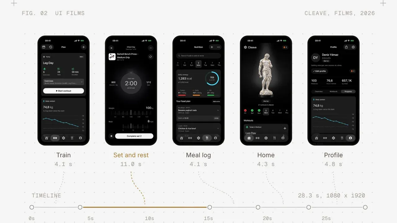
Cleave is one of the apps we build and run ourselves, and its site is the example on our web design page. The site’s main stylesheet opens with a note that its values come from the app’s tokens file. It uses the same black ground, the same card color and the same strengths of white text as the app.
That note changes how the site gets maintained. When someone asks why a line of text on the site is a certain gray, the answer is in the app’s tokens. When the app’s palette changes, the site has a clear list of values to update.
We have done the same for clients. For Guideflow, as its case study puts it, we rebuilt every web page, the product itself and a design system underneath it over six months, so the new decisions would hold as the product grew. For io.net the design system was something the team had not asked for. After launch, new screens could be designed in a fraction of the time, because the system was already there to build from.
What you see during the build
During the build you get a working version you can click through every week, and the site comes together in the same weeks as the product. If a heading on the site sits at a different size from the matching heading in the app, you see the two side by side in the same week, while it is still a one-line change. Our note on weekly builds covers what each of those builds includes. You review one system in two places, and a decision about one shows up in both.
When you already have a product
Sometimes the product is already live and the site still sells its first version. Then we bring the site up to date on the product’s own system: we read the tokens and components the product already uses, fix gaps where they exist, and build the site on top of them.
The same goes the other way. If your product works on the web and people ask for an app, our app development team builds it on the same system. A redesign of part of your site, such as one landing page or one set of pages, is built on the same system as the rest, so it does not become a third look.
For a live product with users and funding, Relaunch starts with a two-week audit of what is live and a written plan. The pricing page compares Relaunch with Zero to launch side by side.
What you leave with
At the end you have the site designed, built and live on your domain, and a design system in which its colors, type and motion are tokens shared with the product. The words live in plain files your team can change. The code moves to you at handoff, along with the tokens both sides read from, so the next person to add a page or a screen starts from the same decisions we did.
If your site and your product look like two companies today, tell us where things stand and we will start from what you already have.